


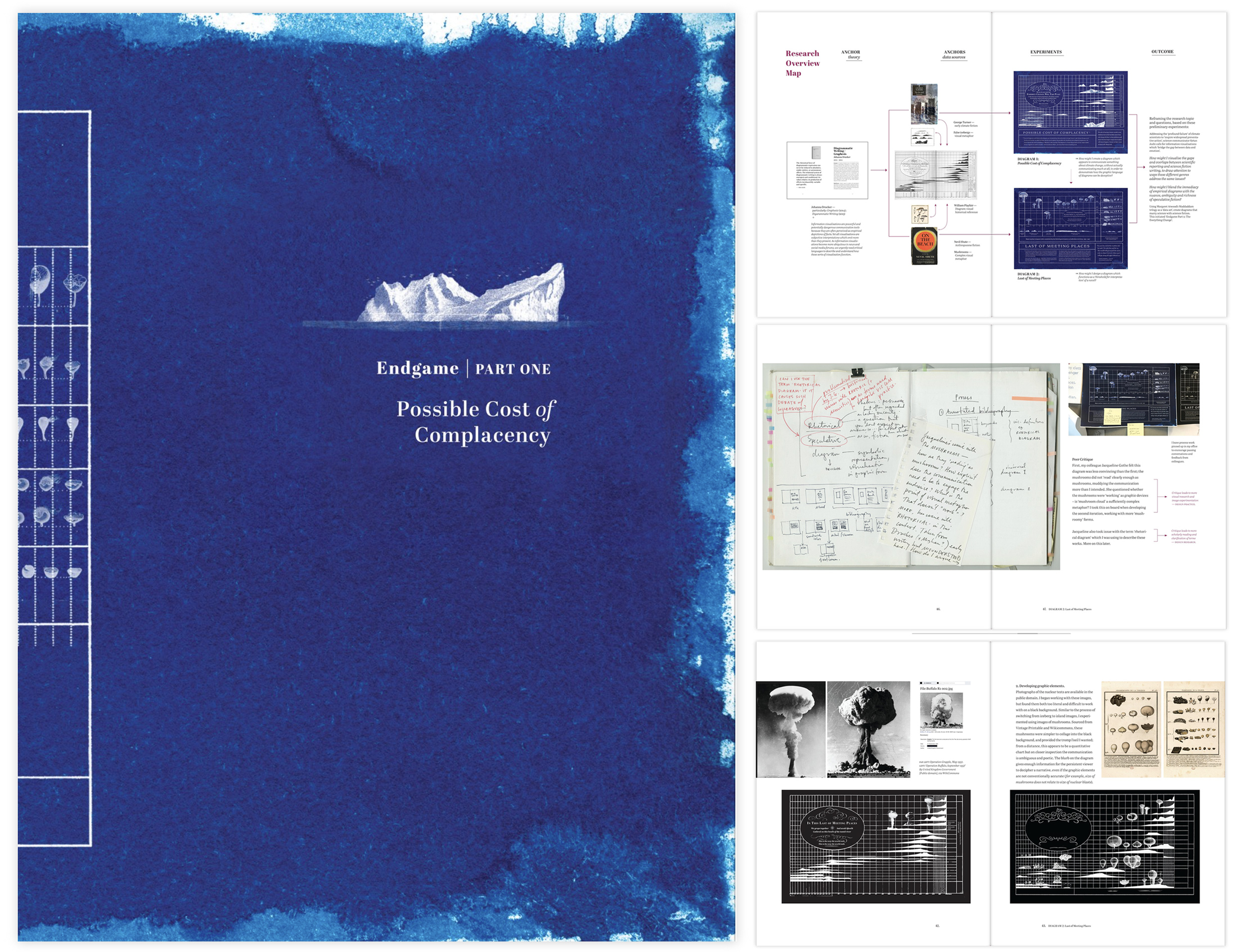
End Game, Part One: Possible Cost of Complacency is the result of conversations Todd McMillan and I had while tinkering in a research studio at UTS. Todd was pairing excerpts from science fiction with photographs taken on a recent trip to Antarctica, while I created collages based on descriptions of landscapes in Australian novels. As we worked we talked about what we were reading at the value of fiction as a way to think through environmental issues. In Antarctica, someone pointed up and said to Todd, ‘that’s the hole in the ozone layer’. An actual hole. We discussed widespread apathy toward climate change and the possibility that where science communication is failing to engage the public in this matter, science fiction may have more success. I decided to look at the two science fiction novels Todd was referencing in his work – Nevil Shute’s On The Beach and George Turner’s The Sea and Summer – to see where they would lead me. Research-through design often starts with a hunch.
The two diagrams I exhibited were conceived of and created between March and May 2017. During this time I was tutoring a group of honours students in the Visual Communication degree at UTS. I often wish I had the time to do the briefs I set students. I decided to make time, and follow the syllabus as I taught it, using the two novels as my starting point.
Over six weeks (the first half of the semester), I took notes in lectures (delivered by Jacquie Lorber Kasunic and other staff, including myself), analysed readings and performed the assessment tasks. The work exhibited comes directly from this process. Below are pages from the Contextual Portfolio which accompanied the work in the gallery:


At a recent research talk, Cameron Tonkinwise stated that one of the most important outcomes of academic research is our teaching – we feed what we learn through our own research into how and what we teach. The contextual portfolio I created alongside the exhibition is a demonstration of what I ask my students to do, and shows how my teaching and research are interdependent. (Read more on ‘contextual portfolios’ here).
These are not finished works. They are part of an iterative design process which I have been brave/foolish enough to share publicly, until I find the time to keep working on them. In particular, the mushrooms are wrong. Here is a more recent (2018) iteration of the Last of Meeting Places diagram with more ‘mushroomy’ representations of the nuclear tests and additional text:

Description, as submitted to the Information Is Beautiful Awards (the work was longlisted for 2018):
This diagram blends content from Nevil Shute’s post-apocalyptic novel On The Beach (1957) with data about nuclear weapons testing conducted on Australian territory in the 5 years preceding the novel’s publication. Mushrooms are a visual analogy for nuclear explosion, but also represent hope; some mushrooms can absorb radioactive isotopes from soil – even if humankind orchestrates a nuclear holocaust, the planet can regenerate without us. It is one of a series of ‘speculative diagrams’ Zoe Sadokierski has designed which merge ecological fiction with real world science.
After the exhibition, I produced a second contextual portfolio which documents the research, including design processes, and how I developed the work in response to peer critique during and following the exhibition. You can purchase a copy from my Blurb site here.
Scholarly context for the research driving the work:
In her book Graphesis: Visual forms of knowledge production, Johanna Drucker aims to establish a critical frame for understanding visualisation as a primary mode of knowledge production, at a time when “graphics of all kinds have become the predominant mode of constructing and presenting information and experience.” (2014: 6) In particular, while recognising that information graphics originate from disciplines such as statistics and the empirical sciences which prioritise quantitative and ‘factual’ statements, Drucker challenges the notion that these visual forms are a priori forms of knowledge (reductive depictions of ‘what is’) and instead asserts that visualisations are always interpretations on the part of the designer, and presents a paradox:
Most information visualizations are acts of interpretation masquerading as presentation. In other words, they are images that act as if they are just showing us what is, but in actuality, they are arguments made in graphical form. But paradoxically, the primary effect of visual forms of knowledge production in any medium—the codex book, digital interface, information visualizations, virtual renderings, or screen displays—is to mask the very fact of their visuality, to render invisible the very means through which they function as argument. (ibid: 10, her emphasis)
We tend to read information visualisations quickly for a summary of a phenomenon or data set, rarely considering what is omitted, or how the interpretative bias of the designer may skew the information presented. To demonstrate how visualisations function as arguments, Drucker calls for design and humanities scholars to experiment with qualitative approaches to information visualisation, approaches which aim to reveal the nuance, ambiguity and subjectivity inherent in qualitative fields of inquiry.
In response to Drucker’s call, I considered: How might I design diagrams which attempt to render visible the ‘authorship’ of the designer, in order to think-through and demonstrate the constructed nature of these visual forms? Therefore, this project is an example of RtD as a form of inquiry – the design work (creating diagrams) is performed in order to interpret and demonstrate a theory (Drucker’s ‘graphesis’).
I began reading Graphesis in late 2016, as the terms ‘fake news’ and ‘alternative facts’ were being normalised in public discourse. I noticed that many diagrams, charts and maps wallpapering news and social media forums have ‘the appearance of meaning’ but, on closer inspection, reveal poorly formed arguments or a lack of comprehensible data. In particular, articles on climate change – both advocating preventative action and denying its existence – rely on empirical looking diagrams to communicate authority, often without communicating much at all. Reflecting on both Drucker’s provocation for experimental visualisation and this proliferation of ambiguous diagrams, I asked: How might I create a diagram which appears to communicate something about climate change, without actually communicating anything at all, in order to demonstrate how the graphic language of diagrams can be deceptive?
I chose to visualise ‘data’ from a science fiction novel about climate change – using graphic language associated with empirical science to depict science fiction seemed appropriately confusing. The diagram ‘Possible Cost of Complacency’ presents excerpts from George Turner’s 1987 Sea and the Summer, a pioneering novel in the ‘cli-fi’ sub-genre, in the form of a chart. The graphical forms on the chart resemble icebergs (common illustrations for ‘climate change’), but do not relate to the text excerpts or represent actual data. My Critical Journaling process led to a significant insight: diagramming science fiction alongside the science that informed it provides an alternate ‘threshold of interpretation’ to both the novel and the science.
This led to the second experiment, ‘Last of Meeting Places’, which blends excerpts from Nevil Shute’s 1957 novel On The Beach with factual data about nuclear testing in the 1950s, to provide thresholds for interpreting this classic novel in the context of the time it was written. In the process of designing this second diagram, I shifted from working with ‘meaningless’ or ambiguous graphic elements (the icebergs in diagram one) to considering how to embed graphic elements which function as a visual metaphor (the mushrooms in this diagram). This diagram blends content from Shute’s post-apocalyptic novel with data about nuclear weapons testing conducted on Australian territory in the 5 years preceding the novel’s publication. Mushrooms are a visual analogy for nuclear explosion, but also represent hope; some mushrooms can absorb radioactive isotopes from soil – even if humankind orchestrates a nuclear holocaust, the planet can regenerate without us.
This approach blends strategies from editorial illustration practice with information visualisation. In turn, this experiment led to a new suite experiments in which I visualised the relationship between Margaret Atwood’s Maddaddam trilogy and the biological science they are based upon, further blending the editorial illustration and information visualisation as well as factual and fictional accounts of ecological science.
The project started as a way to better understand and demonstrate Drucker’s theory of Graphesis. I did not start with a clear idea of final artefacts or scholarly outcomes. I had a hunch the diagrams could be exhibit-able or sufficiently interesting to write about, but this was not the primary driver of the practice. I began designing as a mode of inquiry, a way to understand how diagrams form arguments, through designing them and reflecting on that process. Over the past two years, new research strands have unfurled – focusing on speculative fiction as a tool for storytelling for Anthropocene Transition, examining illustrative approaches to information visualisation. The Critical Journaling practice – contained within a paper journal (sketches, written reflections, data gathering, overview maps), a series of files in Evernote (long-form writing) and Mendeley (annotated bibliography) – has allowed me to capture these strands and untangle them retrospectively. Along the way, I have produced several Contextual Portfolios which capture the RtD process and outcomes at significant, ‘reportable moments’.
Drucker, J. 2014. Graphesis: Visual Forms of Knowledge Production. Cambridge, MA: Harvard UP.