Disturbing the Text:
Typographic devices in literary fiction
Originally published in Book 2.0, vol. 2 no. 1, 2013.
Abstract
In conventional literary fiction, effective typography recedes. Grey rectangles of justified type are so familiar they are essentially invisible on the page, allowing the reader to slip into the world of the book unimpeded by the activity of reading. This article explores ways some novelists use unconventional typography as a literary device, visually interrupting the reader to make a specific point. A range of typographic devices are shown to affect pace, point of view, tone of voice, characterisation and to imply ephemeral documents within novels.
These typographic devices are illustrated with examples from a collection of novels including Mark Z. Danielewski’s House of Leaves (2000), Salvador Plascencia’s The People of Paper (2005), Joanthan Safran Foer’s Extremely Loud and Incredibly Close (2005) and Steven Hall’s The Raw Shark Texts (2007). The article aims to illustrate ways authors have experimented with typographic devices to literary affect, and to encourage more experimentation with word-image interplay as a storytelling device.
Introduction
Typography is the art of designing text, so it can be read. To explain the particular function of typography in novels, it is useful to consider literary theorist Gérard Genette’s delineation between ‘primary text’ and ‘paratext’. ‘Primary text’ is the content originated in the mind of an author – the work of literature in unmediated form. In order to pass from the mind of the author to the hands of the reader, a literary work must be materialized – given physical form as a book. The author releases the primary text to a publisher, who arranges to have it edited, designed, printed, bound and placed within reach of readers. Genette names the collection of elements that mediate this transition between author’s mind and readers’ hands the ‘paratext’. He describes paratext as a ‘threshold to interpretation’:
[Paratexts] surround and extend [the text] precisely in order to present it, in the usual sense of this verb but also in the strongest sense: to make present, to ensure the text’s presence in the world, its ‘reception’ and consumption in the form […] of a book […] the paratext is what enables a text to become a book and to be offered as such to its readers. (Genette 1997: 1, please note: italics are those of the author)
So, paratext is the collection of supplementary elements that frame and present a primary text in a form that can be read – everything from the title of the book to the way it is typeset and the paper stock it is printed on. For this article, it is the typographic elements of the paratext that are most relevant.
Across different editions of a novel, the typographic paratext may change without altering the primary text. For example, while changes in the typeface and the way chapter breaks are visualized may make one edition more visually engaging than another, these typographic elements do not alter the meaning of the text itself. However, this article presents examples of novels in which typography is used as something more than paratext. In these novels, typography is used for literary effect – typographic devices are woven into the fabric of the narrative. These typographic devices are integral to the primary text – they cannot be removed from one edition to the next without significantly altering the narrative. As such, they are unconventional and worthy of scholarly attention.
The first section establishes typographic conventions of the novel, in order to explain what makes typographic devices ‘unconventional’ in this genre. The second section describes a series of typographic devices, organized under subheadings that describe their literary effect: shifting point of view; implied ephemera; narrative pace; and visualization of inaudible parts of speech. The third section critiques two novels that employ a range of typographic devices in more depth, to understand how these devices work in the context of a whole literary work.
Section 1: Typographic conventions of the novel
To understand how typographic devices function in novels, it is important to first show how they are unconventional for the genre. While defining ‘genre’ is problematic,[1] for the purpose of understanding typographic conventions, the definition below raises several important ideas:
A genre is conceived as a set of constitutive conventions and codes, altering from age to age, but shared by a kind of implicit contract between writer and reader […] In the reader, these conventions generate a set of expectations, which may be controverted rather than satisfied, but enable the reader to make the work intelligible. (Abrams 1985: 109–10)
The idea of an ‘implicit contract’ between author and reader is paramount here. The conventions of a genre result in particular expectations by the reader; these expectations guide the reader’s interpretation of a text. For instance, while readers expect books categorized as biographies or memoirs to be ‘true’ accounts of real lives, we expect fiction to describe imaginary people and events. If these conventions are broken, readers can feel confused or even angry. When bestselling memoirs such as James Frey’s A Million Little Pieces and Norma Khouri’s Forbidden Love were exposed as more fabrication than autobiography, readers and critics were outraged – they felt betrayed because the contract they entered into with the author was exposed as false.
As well as stylistic conventions, different genres also dictate typographic conventions. Standard typographic conventions exist to manage the practical aspects of the reading experience. For example, text is typeset in a ‘box’ surrounded by outer margins wide enough that the reader’s thumbs do not obscure the text, and a gutter (inside margin) wide enough that lines of text do not curve into the spine of the book. Navigational elements such as page numbers and running heads loiter in the margins, in the reader’s peripheral vision so not to distract from the primary text, but be easy to locate when required.
More genre-specific conventions also exist. Within non-fiction books, readers understand that shifts in point size and typeface or the addition of elements such as bullet points, line rules, indents and multiple columns visually distinguish between different kinds of content within a primary text.
In verse, typography is often controlled as much by the author as the type designer. Before reading a poem, the visual presentation – the shape of the poem on the page – acts as a signpost to interpretation. Line lengths, text breaks and playful emphasis are expected to be meaningful cues to interpreting the work. As such, poets are often consciously experimental with form; unusual layout and graphic elements are, if not conventional, at least not unexpected. Literary scholar Michael Riffaterre (1980) suggests reading poetry is inherently different from reading prose: you read a poem once to identify the semiotic structure, and then again to understand the structure.
Conversely, the novel is conventionally defined by its typographic restraint – essential in creating an ‘invisible’ reading experience. Novelists usually strive to create verisimilitude – a believable world for readers to enter. No character, event or literary device should distract readers from our state of immersion in the fictional world; readers hear the narrator rather than the author. Conventionally, the typography of a novel strives to support the author’s verisimilitude – well-executed typography allows readers to slip into the world of the book, unimpeded by the activity of reading. Design scholar Beatrice Warde compares ideal typography to a crystal goblet. She argues that a connoisseur of wine would choose to drink from a simple crystal goblet over an exquisitely wrought gold goblet because ‘everything about it is calculated to reveal rather than to hide the beautiful thing which it was meant to contain’ (in Brown 2007). Conventions dictate that the typesetting of a novel should be a transparent vessel, its purpose to convey content to the reader in a simple, elegant way. This is not to say that text does not exist as an ‘image’ on the page – rather that we know we are not meant to see it. In literary fiction, effective typography recedes – the grey rectangle of justified type is so familiar it is essentially invisible, or clear as an elegant crystal goblet.
Subtle exceptions to typographic ‘invisibility’ are necessary to notify readers of significant shifts in time, place, narrative voice or plot. Part titles, chapter headings and text breaks act as ‘signposts’ to the reader, drawing attention to shifts in the flow of the narrative. ‘Parts’ and ‘chapters’ usually start on a new page with a title and/or number to help the reader navigate through the book. A ‘part title’ or ‘chapter head’ may also include a small graphic element – such as an icon or illustrated vignette – generally representing a theme or motif from the story, or repeating a graphic element from the cover design. A text break may be as simple as a line break between paragraphs, or be marked by a glyph such as a star, dot or other graphic element.
These simple typographic conventions are unobtrusive enough to suggest a shift without causing a disruptive jolt in the reading experience. More importantly for this discussion, these typographic elements can be altered from one edition to another without effecting the primary text.
If an author consciously disturbs typographic conventions, we must assume it is meaningful. Readers must consider why they have been drawn back to the printed page, back to the material surface of the book. Although perhaps less scandalous than ‘fictional memoirs’, the integration of typographic devices in novels breaches contemporary conventions of the genre, redefining the contract between author and reader. The purpose of this article is to explain how these devices can effect the reading experience, and be recognized as valuable additions to the novelist’s toolbox. The next section describes the way typographic devices can be used to denote a shifting point of view; imply ephemera; effect narrative pace; and visualize inaudible parts of speech.
Section 2: Examples of typographic devices and their literary effect
1. Denoting shifting narrative voice/point of view
A common typographic device is alternating typefaces to denote a change in narrator. Bestselling author Jodi Picoult often narrates each chapter of her novels from the point of view of a different character, with each character typeset in his or her own ‘face’. It is a subtle device, and not necessarily effective. Although I noticed the alternating serif and san serif typefaces while flicking through one of Picoult’s novels (a book designer’s habit, to get a ‘sense’ of the type design), while reading the novel, I forgot about it – the shift was too subtle for me to register, even as a typographically curious reader. Unless the differences are highly distinctive, the average reader is unlikely to detect the shift between similar sized typefaces. For this technique to have impact, the shift in typeface needs to be graphically disruptive on the page.
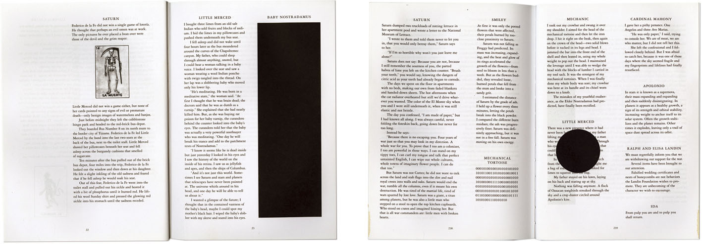
Salvador Plascencia’s debut novel The People of Paper (2005) is also narrated by multiple characters, including an omniscient narrator who presents himself as the ‘author’. It is a puzzle of a story, following the plight of a dozen heartbroken protagonists as they rebel against the planet Saturn, anthropomorphised here as the omniscient ‘author’ who intervenes throughout the novel, struggling to control his chaotic characters. In order to steer the reader through the constantly changing narrative voice and visualise the interventions of the ‘author’, Plascencia employs more graphically obvious devices than subtle shifts in typeface described above. The typesetting grid changes from a single column to two or more columns per page when multiple characters narrate in quick succession. The typeface does not change, but some characters have graphic and typographic ‘quirks’ that are recognisable at a glance. For example, Baby Nostradamus is a soothsayer who sees only blackness; passages narrated from his point of view are obscured by solid blocks of ink. In passages narrated by the ‘author’, die-cuts literally remove the name of an ex-lover he cannot let go. Throughout the novel, sections of text with strike-through marks, solid blocks of ink, scattered diagrams and illustrative elements clutter the page. At a ‘flip through’, these devices call attention to the fact that this is an experimental novel, that something unusual is happening on the pages of the book; the devices visually communicate the struggle between ‘author’ and his characters for control of the narrative.
2. Narrative pace
Novelists employ a range of literary devices to manage the pace of their narratives. The examples below show how manipulating the typographic composition of the page can physically alter the pace of reading.
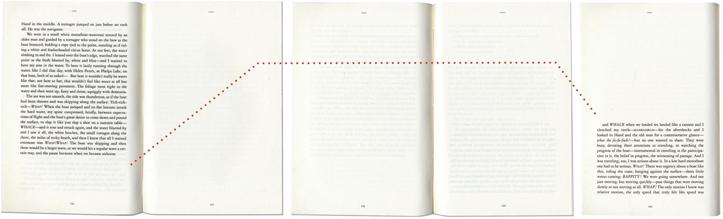
Dave Egger’s novel You Shall Know Our Velocity (2009) recounts the adventures of narrator Will and his childhood buddy Hand, as they embark on a fool’s errand – to circumnavigate the globe in a week, handing out $32,000 to strangers. As Will describes being on a powerboat surging through waves, the sentence ‘the pause between when we became airborne…and WHACK when we landed’ is broken with several blank pages.
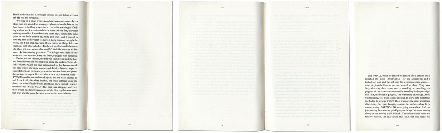
Turning the blank pages to get to the end of the sentence, we experience the soaring pause as Will does. Graphic space effects reading pace – this device allows us to share the velocity of one of the few moments in the novel that Will experiences pure exhilaration. The execution of this break is particularly effective because it starts towards the bottom of the first page, soars across the facing page, the double page spread, then comes back down to almost where it started. Our eyes are forced to follow the trajectory of the boat:
Mark Z. Danielewski’s ambitious novel House of Leaves (2000, Pantheon Books) is a dark piece of speculative fiction, set in a house that is larger inside than it is outside. Four graphically distinct typefaces distinguish between four parallel narratives, and complicated page layouts reflect the narrated action. As characters advance through the claustrophobic labyrinth of a house that defies real-world logic, the text is set in tight boxes and columns bending in different angles around the page, so the reader must physically turn the book, working hard to follow the narrative. In another section, as characters are pursued by an unseen enemy, few words or phrases appear on each page urging the reader to flip quickly, propelling the pace of reading to match the action in the scene. This typographic framework effects narrative pace by manipulating the act of page turning. The experience of the reader mimics the experience of the characters.
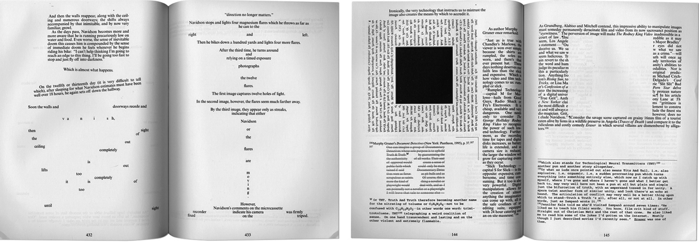
For some, the constant physical disruption of the text may be too distracting to endure. Reviewer Emily Barton (2006) asks: ‘…the question for each reader is if the payoff makes the effort of slogging through its endless posturing worthwhile’. For others, it is an exciting interactive reading experience, familiar to readers of new media texts. Design writer Rick Poynor (2003) declared: ‘The positive reaction to House of Leaves suggests the degree to which readers’ tastes have already been transformed by exposure to devices, texture and rhetoric of contemporary graphic culture.’
3. Implied ephemera
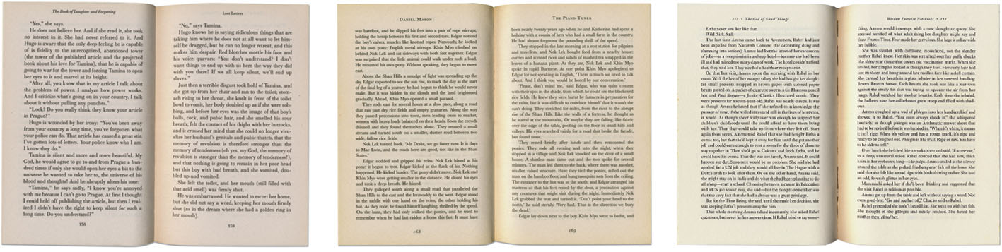
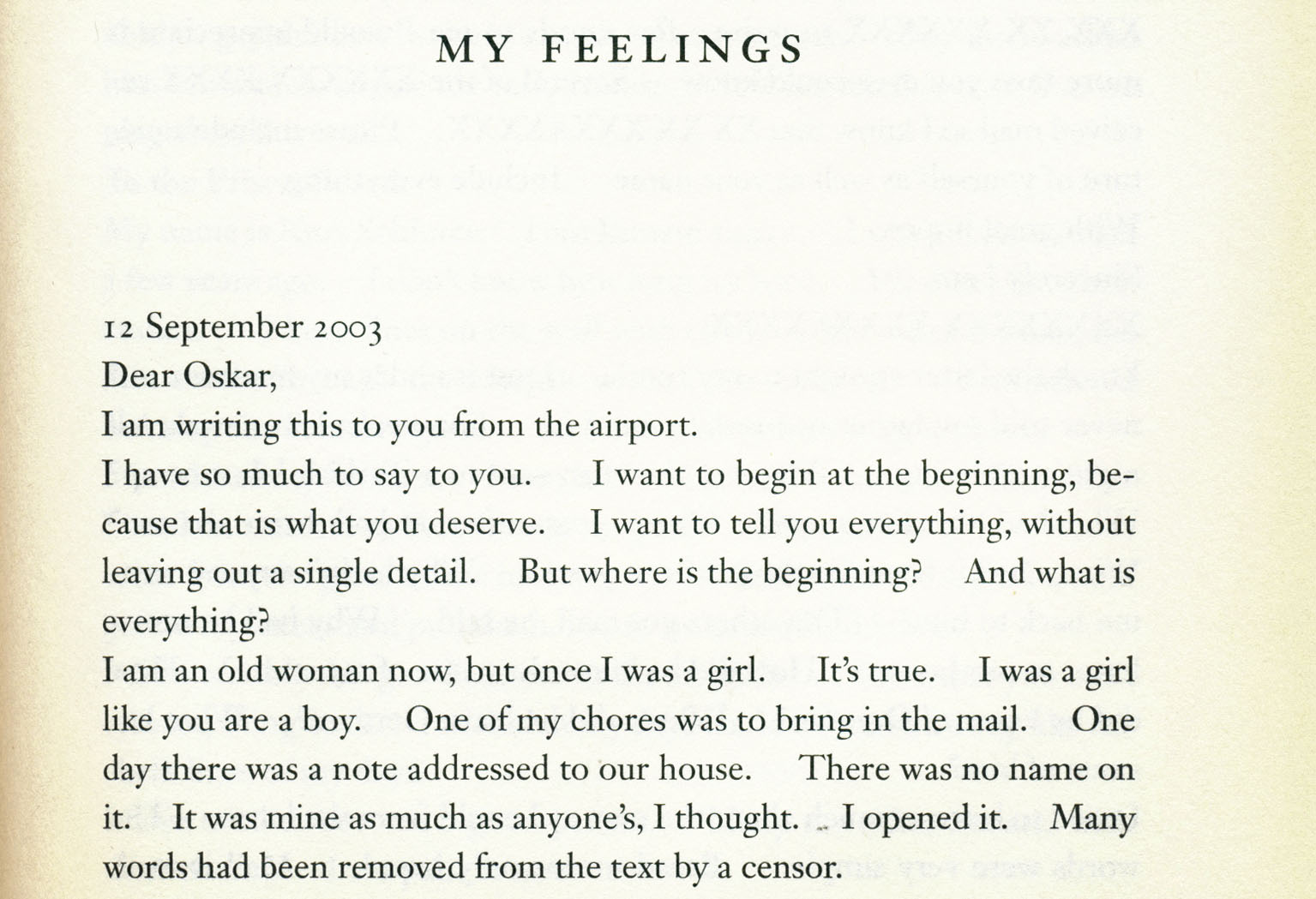
When text is typeset so it resembles an ephemeral item – a letter, a poster, a computer screen – the typesetting implies a familiar form. Even a very simple shift in typesetting can imply ephemera. Here are three letters, presented on the pages of three novels:
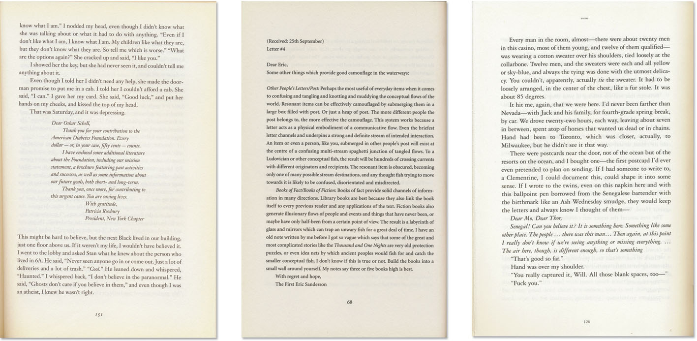
These three novels ‘show’ letters in three different ways. We know they are letters because they are addressed to a person – ‘Dear …’ – but the typesetting provides an additional visual clue that the point of view has shifted from the narrator of the story to the narrator of this letter or document.
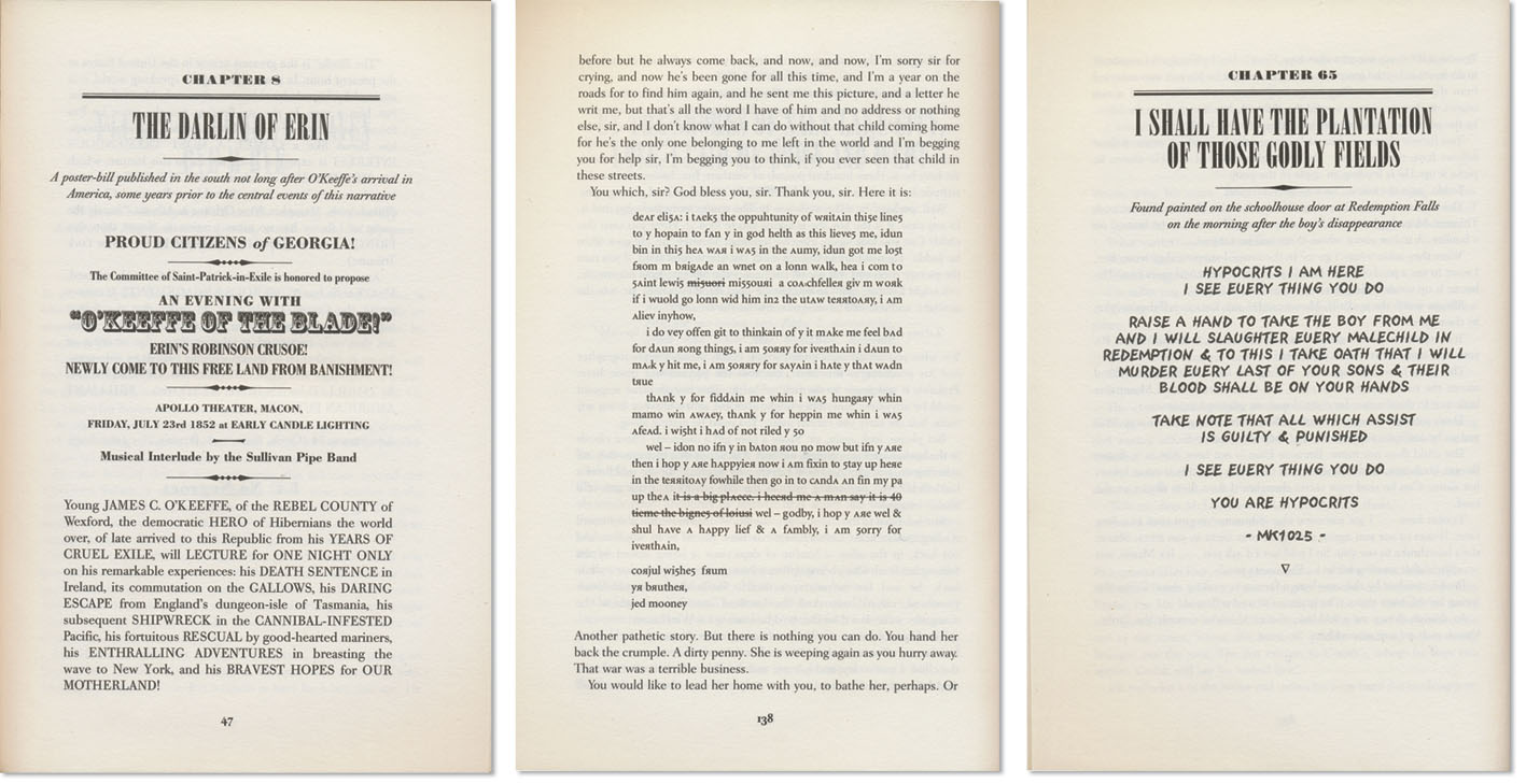
Joseph O’Connor introduces more complex examples of implied ephemera in his historical novel Redemption Falls (2007). Set in the devastation of the American Civil War, it is more a collection of stories than a cohesive narrative. Multiple accounts of the same events are narrated by different characters and voiced through a scattered archive of ephemera: bill posters, letters, press reports, photographs, maps and period vignette illustrations. Some of these are items of ‘actual’ ephemera that have been scanned in and reproduced on the pages of the novel, while others are implied by the typesetting. The first page (below) presents a text block in a way that implies a bill poster; the second implies a letter written by a barely literate character – letterforms are backwards or written incorrectly, reinforcing the character’s illiteracy; the third implies a piece of text scrawled on the wall of a building. The ‘Old West’ setting provides a context in which to understand these implied documents.
In the examples above, reproducing the actual ephemera – an original-looking bill poster, a badly scrawled letter or a photograph of the building – is not required for most readers to recognise the texts that are implied.
Another example of implied documents or ephemera is Douglas Coupland’s J-Pod (2006). The novel observes a group of cynical twenty-something computer-game developers who speak in contemporary movie quotes and advertising slogans.
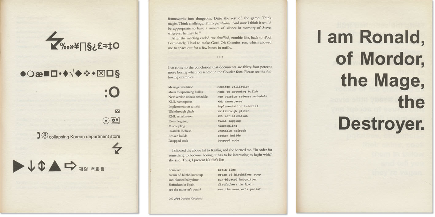
Constantly changing typefaces, text fragments reminiscent of SMS and computer scripting, and pages of seemingly nonsensical numbers or symbols generate a kind of graphic white noise that defines the culture of this novel. Through these graphic devices, Coupland shows us that in the contemporary environment, language and dialogue look different – that some language has a particular, familiar visual form that instructs us how to interpret it.
Although ephemera is usually paper based, these digital texts present another kind of ephemeral document, particular to the characters’ world. As with O’Connor’s bill poster, Coupland need not show the computer or mobile telephone screen here; the typesetting implies the material associations of this digital ephemera and adds a visual authenticity to the language used in the novel.
4. Visualizing inaudible parts of speech
Originally published in nine volumes, The Life and Opinions of Tristram Shandy, Gentleman (1759–67, published by Ann Ward/Dodsley/Becket & Dehondt) is one of the earliest books to be considered a novel. Laurence Sterne’s classic social satire employs an array of devices to interrupt the narrative. Passages of elongated em dashes — — — and asterisk * * * denote lengthy pauses or deliberately omitted dialogue. Also included are more graphic devices: a black page visualizes the death of a character; a page is left blank for the reader to draw his or her own impression of another character; and diagrams map how the storyline has meandered across the nine parts (or volumes) of the book. Particularly infamous is the marbled page, which graphically represents the ‘contribution’ the narrator’s father made to his conception.
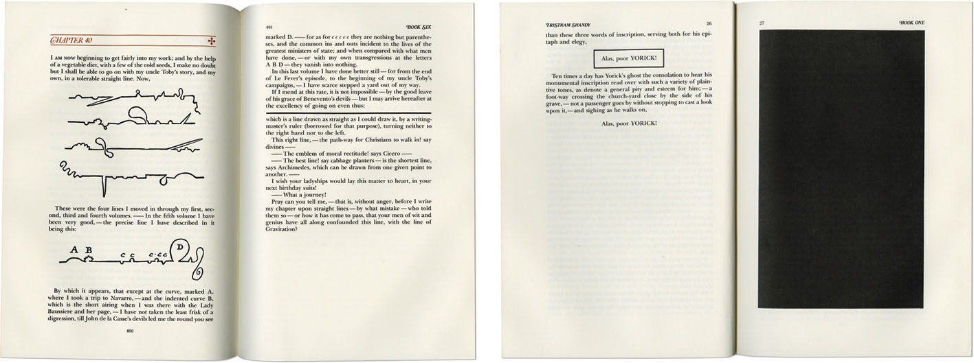
Sterne’s graphic and typographic playfulness interrupt the flow of the narrative in an attempt to make us aware of our reading experience – Sterne consciously explores the relationship between himself and his readers by drawing our attention to the marks on the page. These typographic interruptions are comparable to narrative asides, distracting the reader and forcing us to consider the ‘experience of interacting with the book as a consciously constructed object’ (Schiff 1998).
More than drawing our attention to the ‘consciously constructed’ book in our hands, these devices form a unique typographic ‘language’ that we learn to comprehend as we engage with the novel. They are based on typographic conventions – readers understand that em-dashes demark a break in thought, and that an asterisk calls out a footnote, aside or ‘jump’ to a different thought – from this base knowledge, we can figure out what the unconventionally extreme use of these glyphs implies. Within the author–reader ‘contract’, the author places his trust in our ability to make this conceptual leap, as we in turn trust that he is stringing us along for a reason.
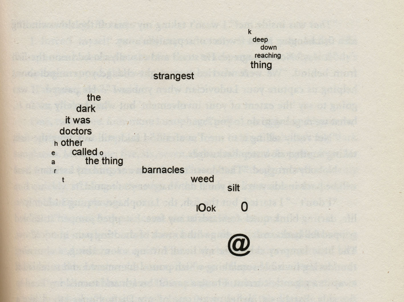
What Sterne’s typographic language attempts to communicate is inaudible parts of speech – the awkward silences and pregnant pauses that are so present in conversation, but so difficult to put on the page in words. Words are limited in their ability to describe silence, or the unspeakable.
Despite Sterne’s early experiments, few other authors have attempted to visualize inaudible parts of speech using typographic devices. Perhaps other authors found the words they needed, though evidence of the problem persisting is eloquently documented two centuries later, where Dorris Lessing writes in The Golden Notebook (1962):
During the last weeks of craziness and timelessness I’ve had these moments of ‘knowing’ one after the other, yet there is no way of putting this sort of knowledge into words. […] Words. Words. I play with words, hoping that some combination, even a chance combination, will say what I want. […] The fact is, the real experience can’t be described. I think, bitterly, that a row of asterisks, like an old-fashioned novel, might be better. Or a symbol of some kind, a circle, perhaps, or a square. Anything at all, but not words. (Lessing 1962: 481)
Lessing’s narrator seems to refer directly to Sterne’s typographic devices in this passage, and yet she does not attempt to develop a typographic or graphic solution to the perceived paucity of words available to her. Perhaps it takes a particular kind of visual-verbal sensitivity to develop a whole new vocabulary of marks.
One author with such visual-verbal sensitivity is Jonathan Safran Foer. Forty years after Lessing bemoans that ‘anything at all, but not words’ is needed to address the difficulty of verbalizing inaudible parts of speech, Safran Foer develops a system of glyphs to communicate the particular silences of his family in the short story ‘A Primer for The Punctuation of Heart Disease’. Safran Foer introduces his nuanced punctuation marks, backed up with examples of use in actual conversations. For example:
Placed at the end of a sentence, the ‘pedal point’ signifies a thought that dissolves into a suggestive silence. A few weeks ago, my younger brother was having problems with his heart, which ended in a week in intensive care. He’s been having one long heart attack for six years. ‘I know (pedal point)’ I said. ‘I know (pedal point)’ He said. (Safran Foer 2002: 281)
The short story introduces the reader to the new punctuation language, concluding with a passage in which an entire, awkward and very moving conversation between the author and his father is put on the page almost entirely in glyphs.
This short story is not Safran Foer’s only foray into the world of typographic devices. His first novel Everything Is Illuminated (2002) changes typefaces to distinguish between different narrators and implies different types of ephemera through varied layout. However, it is his second novel, Extremely Loud and Incredibly Close (2005) where Safran Foer’s command of typographic devices is most noteworthy. In order to understand how typographic devices can have a significant effect in the context of a whole novel, it is important to discuss some examples in greater detail. The next section critiques two novels that employ a range of typographic devices for varying literary purposes.
Section 3: Detailed analysis of two novels with typographic devices
Here two novels – Jonathan Safran Foer’s Extremely Loud and Incredibly Close and Steven Hall’s The Raw Shark Texts (2007) are presented as case studies in which typographic devices are effectively integrated into the primary text. Each example begins with a plot synopsis, followed by descriptions of the devices and critique of their literary effect.
Extremely Loud and Incredibly Close
(a) Synopsis
Extremely Loud and Incredibly Close observes three generations of the Schell family, all traumatized by the loss of loved ones. Three narrative voices tell the family story.
The first and central narrator is Oskar Schell, a precocious but fragile 9-year-old, devastated when his beloved father Thomas dies in the September 11 World Trade Centre attack in New York City. Trapped in the second burning tower, Thomas leaves five messages on the family answering machine that Oskar returns home to hear. The last message is left moments before the tower falls, while Oskar is home but too frightened to pick up the phone. Guilty and in shock, Oskar replaces the answering machine, hiding the messages from his mother: ‘That secret was a hole in the middle of me that every happy thing fell into’ (Safran Foer 2005: 71). A narrator in the vein of Huckleberry Finn and Holden Caulfield, Oskar’s idiosyncratic vernacular is characterized by hyperbole and oddly poignant phrases. He describes his grief as ‘wearing heavy boots’, answers ‘I’m okay’ when his name is called, dresses exclusively in white, claims to competently play ‘Flight of the Bumblebee’ on the tambourine and imagines inventions like ambulances that assure passers-by a loved one is not aboard. One reviewer describes him as: ‘the kind of child that adults adore and kids love to pick on’ (Jain 2005). Homemade business cards, implied on the page by typesetting, declare him:

Sulking in his father’s closet while his mother and her new ‘friend’ play Scrabble, Oskar accidentally breaks an unfamiliar blue vase. Inside is a small envelope with the word ‘Black’ written in red pen, in Thomas’s handwriting. Inside the envelope is a key. Oskar imagines this key is a mystery he must solve – he speculates that ‘Black’ is a name belonging to someone who knew his father:
I decided I would meet every person in New York with the last name Black. Even if it was relatively insignificant, it was something, and I needed to do something, like sharks, who die if they don’t swim, which I know about. (Safran Foer 2005: 87)
For most of the novel, Oskar tramps across the five boroughs of New York, door-knocking an eccentric collection of people with the surname Black, hoping to find the lock to match this mysterious key, but mostly trying to keep his father present in his daily life.
Oskar’s grandparents narrate two letters, which run parallel to Oskar’s narrative. They met in war-torn Germany, but not as lovers. An adolescent Grandma used to spy on Thomas Senior kissing her older sister, Anna. Anna dies, pregnant with his child, in the firebombing of Dresden. Thomas Senior falls permanently mute from grief. Years later, he randomly meets Grandma in a New York City bakery, and they marry out of mutual bereavement for Anna. They create a stifling silent life together, literally dividing their apartment into zones of Something and Nothing. When Grandma falls pregnant, Thomas Senior feels she has betrayed the ‘rules’ of their union and deserts her, fleeing back to Dresden, and so is known as neither father to Thomas, nor grandfather to Oskar.[2] Grandma raises Thomas alone and shares a special bond with Oskar. Thomas Senior returns to New York City after forty years – too late to meet his son. Grandma allows him to move into the spare room in their apartment, but refuses to let him meet Oskar. Slowly, he does befriend his grandson, but is known to Oskar only as Grandma’s ‘renter’.
The grandparents’ letters are presented between Oskar’s chapters. Chapters titled ‘Why I’m not where you are’ are pieces of Thomas Senior’s letters, written to Thomas – the son he never meets. Chapters titled ‘My feelings’ are sections of a letter Grandma writes to Oskar; she did not tell her sister that she loved her the night before Anna died, and this letter attempts to ensure that Oskar knows she loves him now. These letters allow Safran Foer to present two adult perspectives of grief alongside Oskar’s.
(b) Analysis of typographic devices
Although this article focuses primarily on typographic devices, it must be noted that Safran Foer uses an array of graphic devices within this novel. Aside from the typographic devices discussed below, other devices include photographs, pages of handwritten words, passages corrected with red editing marks, images sourced from newspapers and the Internet. I provide a detailed analysis of these other graphic devices in my doctoral thesis (Sadokierski 2010).
Within this novel, Safran Foer manipulates typesetting in two ways: first to distinguish between the three different narrative voices; and second to disrupt pace and the rhythm of reading in order to communicate gaps in conversation or pregnant silences.
Narrative voice
The three first-person narrators composing Extremely Loud and Incredibly Close – Oskar, Grandma and Thomas Senior – are visually recognizable by different typesetting styles. The novel begins with Oskar’s narrative, and his chapters form the majority of the novel. Although occasionally interrupted by reproductions of photographs and ephemera, Oskar’s narrative is typeset conventionally for a novel; Oskar’s chapters establish the typesetting convention – in contrast, the other two chapters are both seen as unconventional.
Grandma’s ‘My feelings’ chapters feature uncommonly large spaces after full stops:
The gaps effect our reading of these chapters. This typographic device references the ‘tabs’ on the typewriter Grandma uses to tap out her letter, but also injects pauses between sentences – a kind of visual reference to the breathy quality of a grandmother’s speech.
Thomas Senior’s ‘Why I’m not where you are’ letters are dated, ranging from before Thomas’s birth (5/21/63) to after his death (9/11/03). In contrast to his wife’s chapters, his are distinguished by long-winded sentences and a total lack of paragraphing. His letters are stream of consciousness passages – a man who does not speak need not pause for breath. For the reader, these chapters carry a manic, fretful tone. The restless stream of Thomas Senior’s letters is only broken when he presents a page from one of his ‘daybooks’ – either a single line of text or a photograph of a doorknob, as discussed shortly.
These different typesetting styles help distinguish between the different narrative voices, which speak from different continents and eras concurrently. The visual presentation of the different narrators also effects the tone of their narratives, alluding to the idiosyncratic voice of each narrator.
Pace and rhythm
Unconventional typesetting is also employed to disrupt the pace and rhythm of reading. Safran Foer breaks the typesetting grid at several points, to achieve particular effects.
When Thomas Senior becomes mute, he tattoos the words ‘yes’ and ‘no’ on the palms of his hands so he can ‘wave’ answers to simple questions. For other communication, he carries small ‘daybooks’ in which he writes, as briefly as possible, what he needs to say:
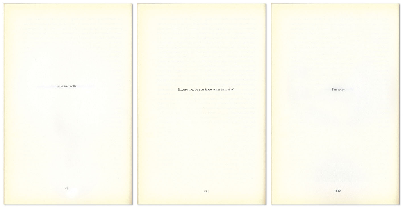
Presenting these snippets one line per page, as they would appear in his daybooks, interrupts the pace of reading. We experience what the baker, the stranger or his wife experience – an isolated phrase floating with limited context. This device also echoes the profound loneliness of Thomas Senior’s world – the whiteness of the page surrounding the line of text breaks his relentless, unpunctuated narrative, effecting a sense of isolation and silence.
A particularly powerful use of this device is when Thomas Senior describes deserting Grandma. She is ill with a cold, and he leaves her at their apartment, uncertain whether she understands that he is deserting her. Six pages of single daybook entries follow – his part of the conversation:
I want to buy a ticket to Dresden.
What are you doing here?
You have to go home. You should be in bed.
Let me take you home.
You’re being crazy. You’re going to catch a cold.
You’re going to catch a colder.
No further explanation of this scene follows. Grandma’s unheard dialogue – floating between the pages that present these stark sentences – evokes the scene powerfully. Safran Foer has given us time – through the space on the page – to empathize with Grandma in this painful moment. The barren description speaks volumes in the white space.
When Thomas Senior returns to his family after forty years of self-imposed estrangement, he begins shadowing Oskar – desperate to be close to him but respectful of Grandma’s rule that he cannot meet him. They first meet face to face when Oskar comes crying to Grandma’s house, but she is not home. Thomas Senior tells us how he silently listens as Oskar pours his heart out, and plays him the final answering machine message from his father in the burning tower. After Oskar leaves, Grandma returns home and they make love for ‘the last time’, then the next morning Oskar appears and confides that he wants to dig up his father’s empty grave (Thomas’s body was never recovered). As this narrative cascades out of Thomas Senior, the leading becomes tighter and tighter until pages are black with overlapping lines of text:

The visual juxtaposition between this heavy ink and the whiteness of the single-line daybook entries visualize the complexity of his heartache. The unreadable mess of text represents the devastating experience of facing his family, and their collective heartache, after years in self-imposed isolation. Through this device, we share Thomas Senior’s anxiety and claustrophobia as his world becomes overwhelmingly emotionally complex after he returns to his wife and meets his grandson.
Another example of typography manipulating the pace and cohesion of reading occurs when Oskar eavesdrops on an angry conversation between his mother and his therapist, discussing whether Oskar is a danger to himself and needs to be hospitalized (he inflicts bruises on himself when frustrated or sad):
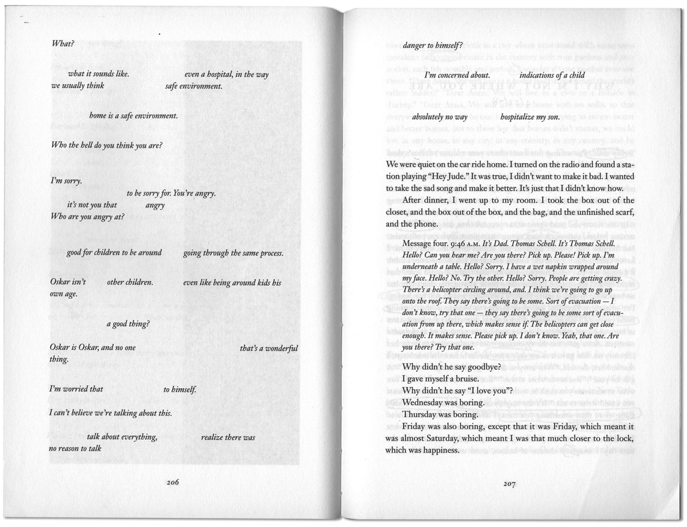
Yawning gaps in the text represent parts of the conversation Oskar misses through the closed door. The passage could be contained on one page instead of across three by representing these omissions with ellipses. But an ellipsis is the same no matter how long the pause – the way our eyes move across this physical space between phrases muddles the conversation. We strain to guess what we have missed, just as Oskar does; we do not understand the whole conversation, but we know the gist of it is not good. For the reader, the typographic fragmentation simulates Oskar’s experience, and amplifies his confusion and anxiety.
Similarly, when Thomas Senior encourages Grandma to write her life story – before he leaves her – she types a thousand pages. Thomas Senior picks them up:
Presented with the blank pages, we are as puzzled as Thomas Senior: has she not typed anything? Then we are told the typewriter ribbon is ink-less and her eyes are too ‘crummy’ to notice. Through this device, the pages of Grandma’s desolate biography are placed into our hands, for us to slowly realize the awful fact as Thomas Senior does.
By manipulating the typesetting, Safran Foer shifts the pace of the narrative – slowing it down with white space, and disrupting it with overlapping or omitted text – making us share the character’s experience, in ‘real time’.
The collection of typographic devices Safran Foer weaves into this novel are effective – they are not so disruptive as to make reading a chore, but not so subtle that they do not register as significant to the reader. Yet some critics belittle the use of typographic devices and images in Extremely Loud and Incredibly Close as ‘tricks’ and ‘gimmicks’.[3] Safran Foer defends his use of these visual devices, stating:
It’s a shame that people consider the use of images in a novel to be experimental or brave. No one would say that the use of type in a painting is experimental or brave. Literature has been more protective of its borders than any other art form – too protective. Jay-Z samples from Annie – one of the least likely combinations imaginable – and it changes music. What if novelists were willing to borrow? (Hudson 2006)
Advocates recognize Safran Foer as an innovative writer with a sophisticated understanding of work–image interplay. The preface to Joe, a collaborative publishing project between Safran Foer and photographer Hiroshi Sugimoto reads: ‘Safran Foer’s deep interest in the juxtaposition of the visual arts and poetic language predestined him to be part of the project’ (Safran Foer, Sugimoto and Matsumoto 2006). Safran Foer explains his use of typographic devices simply: ‘Most of what I do in my books I do exactly because I can’t explain in any other way’ (Gerber and Triggs 2006).
-
The Raw Shark Texts
(a) Synopsis
We meet narrator Eric Sanderson as he wakes up on the floor, retching for breath, with no memory of who or where he is. Cut to a psychiatrist’s office, where Dr Helen Randle – ‘a large clashing event of a woman’ – explains to Eric that he suffers from a rare form of ‘dissociative amnesia’, caused by the accidental drowning of his girlfriend Clio, while the couple were happily holidaying in Greece three years earlier. We have just witnessed Eric’s eleventh relapse, each incident erasing more of his memory than the last. However, when Eric begins receiving letters from his ‘former self’, an alternative explanation is offered: before us is the second Eric Sanderson, inhabiting the body of the first Eric Sanderson, whose human memory and ‘intrinsic sense of self’ is being devoured by a Ludovician – a ‘conceptual shark’.
Hall’s surreal premise is as follows: all human minds are linked by vast streams of language and thought – swimming through these streams are conceptual thought-fish. The Ludovician is the most dangerous thought-fish, feeding on chunks of human personality and memory, or, in Eric’s case, repeatedly attacking until there is nothing left but the shell of a person. The story is a romance/adventure/horror/meta-text that follows Eric and a motley cast of accomplices/enemies (who belongs to which category is part of the intrigue) on a quest to escape the fate of the first Eric Sanderson. The reader is constantly uncertain whether Eric is suffering from a mental breakdown or has slipped into a parallel world.
The title offers a clue on how to approach this dense, experimental work. Say it out loud; it is a play on the Rorschach test, used by psychiatrists to examine psychological and emotional characteristics of a patient by analysing their interpretation of inkblots – apt for a thriller about an amnesic man that can be read in a variety of ways.
(b) Analysis of typographic devices
Hall introduces his typographic devices gradually. The first appears as a frontispiece – between the cover and title page:
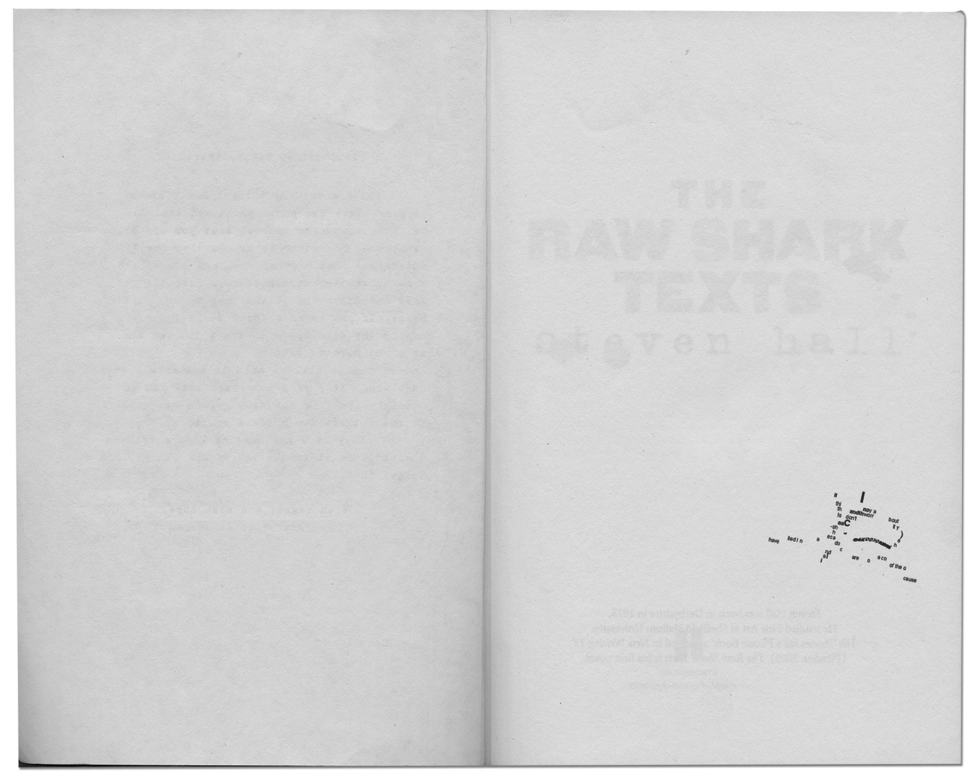
The device above is a hybrid in the sense that the shape is formed by letters and punctuation marks, but it is illustrative because it ‘reads’ as a picture of a shark, rather than a piece of writing. The little typographic shark swimming here, out of context and without a caption, signposts that potentially other graphic devices follow.
As readers, we learn about the existence and complexity of the conceptual world as Eric II does, piece by piece. Aside from this frontispiece shark, the first time we see ‘matter’ from the conceptual world is the ‘dust and debris’ floating on the page:
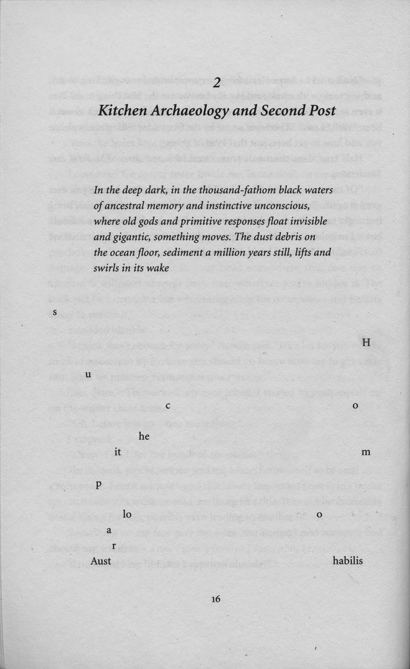
Scattered letters seem to drift up from the bottom of the page, spelling the words ‘Australopithecus’ and ‘Homo habilis’ – two extinct species of early man. These fragments are particles of the conceptual other world, composed of the thoughts and memories of all humankind. Hall starts his explanation of the conceptual world at the beginning of time, with simple matter from the origins of human existence.
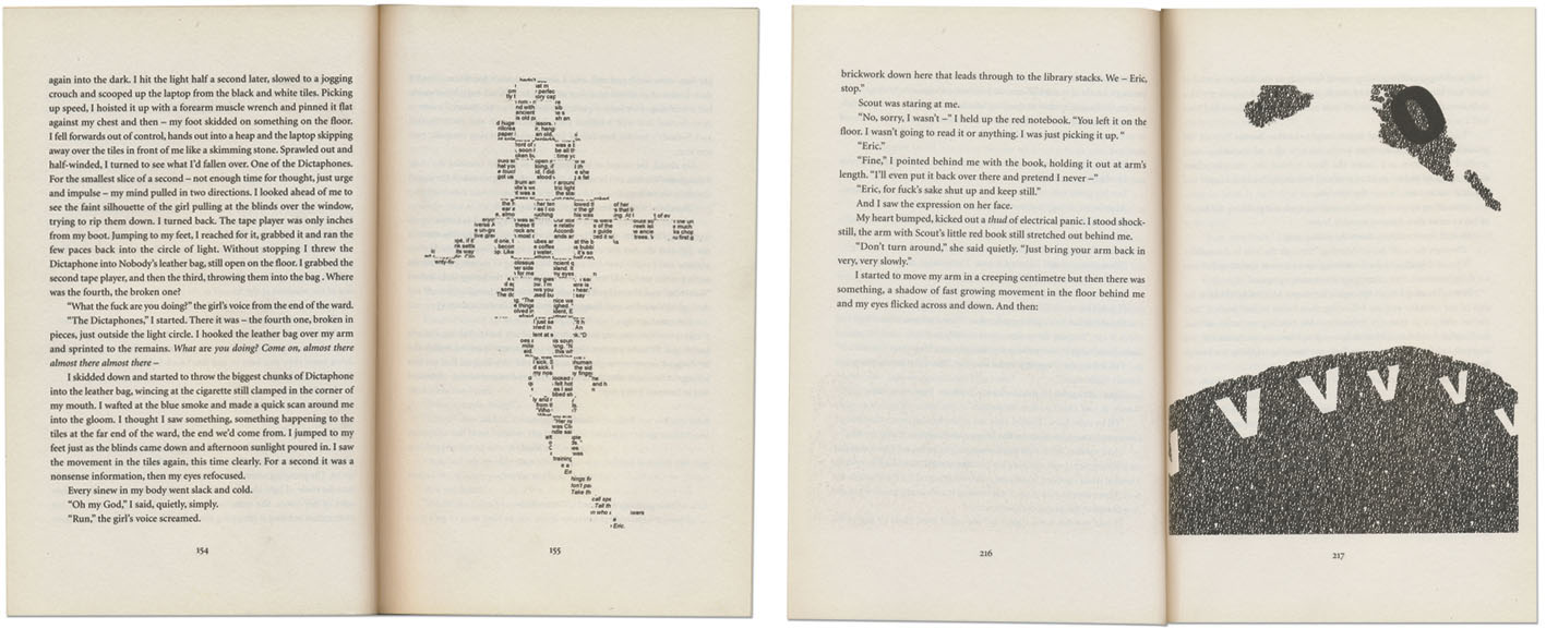
The first encounter we witness between the Ludovician and Eric II occurs in his living room, when the creature emerges from the static in Eric’s television:
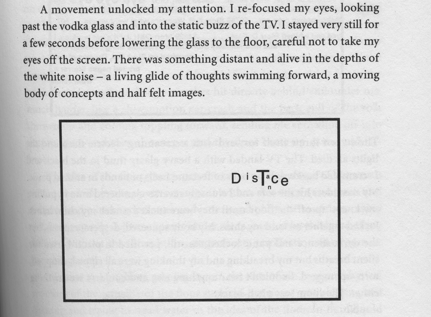
He crawls closer, and suddenly:
Hall represents the Ludovician crossing from the conceptual to the physical realm visually; the television is a thin black frame on the page, the shark illustrated as a collection of typographic marks. The cropping implies that this monstrous creature is peering at us with one beady eye, its hulk looming somewhere beyond the screen. Our understanding of the frame as a television screen gives scale to the unfamiliar form – if this is the eye, the shark is enormous. As Eric II crouches before it, the Ludovician smashes through the screen in a ‘sea’ of memories, sensations, letters, words and images, in a scene reminiscent of The Ring (and countless other horror films).
Before this attack, Eric is aware of his own fragile mental health and is highly sceptical about the existence of a conceptual shark, but it bursts through as a real entity – for Eric the ‘conceptual fish’ becomes a physical predator and, for the reader, the verbal description becomes visual. As the Ludovician crosses the channel from conceptual to physical, the description crosses from verbal to visual. Hall explains on his publisher’s web site: ‘Whenever the shark appears I wanted it to be in text because I like the idea that you part imagine it and part see it, so the shark kind of exists in between this visual and mental arena’ (Harper Collins Canada 2007).
This typographic device appears at three other points in the novel when the Ludovician manages to locate and attack Eric II. First (left) when it swims below a tiled floor, and second (right) when it attacks in a tunnel:
The second image bears a clear resemblance to a famous still from the film Jaws. The most ambitious is the third visualization, at the climax. An obvious homage to Jaws, the shark attacks flipbook-style as Eric II and companions are adrift on a conceptual boat (of course). Seven blank pages establish anticipation, then slowly, in the distance, the shark emerges:
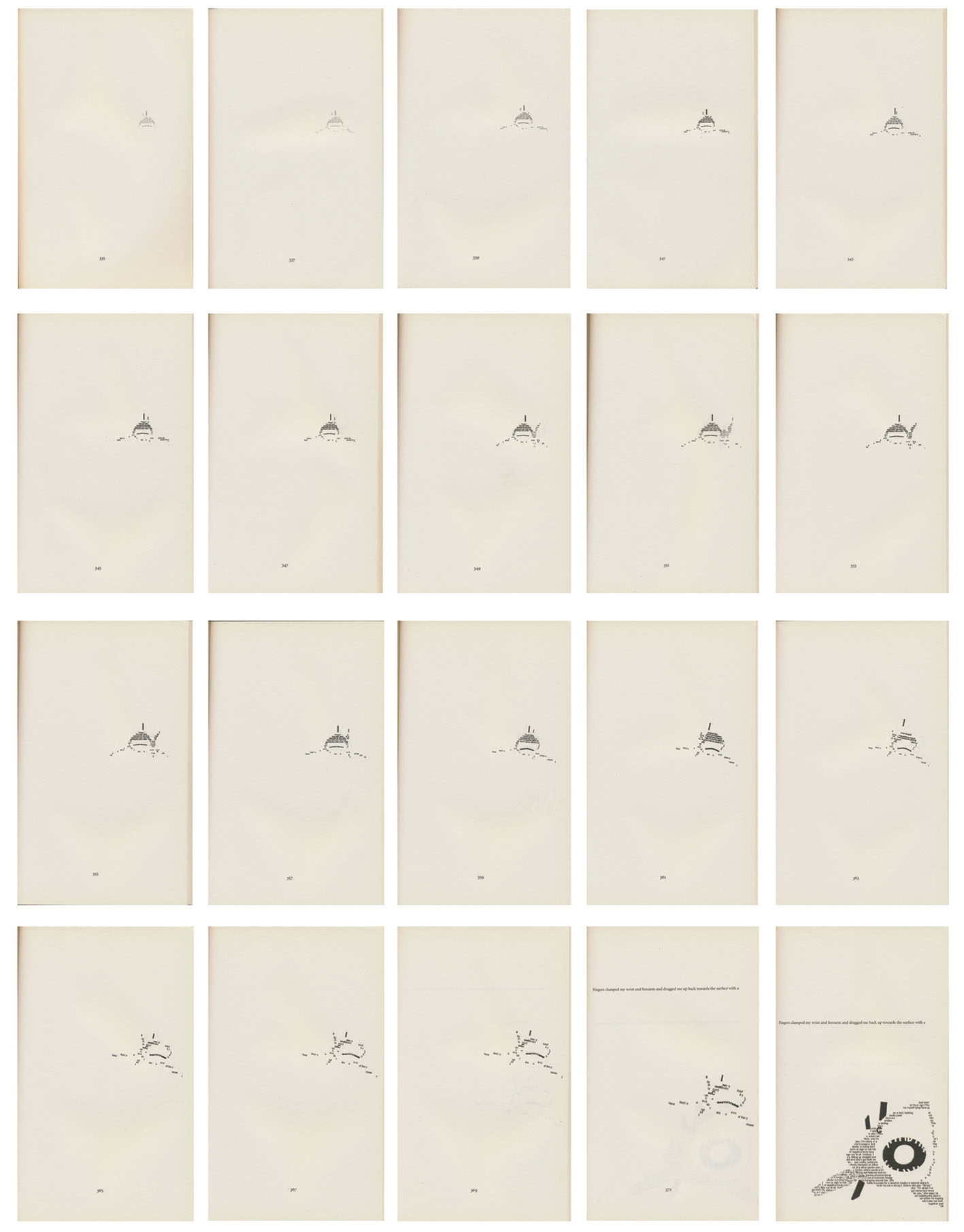
In flipping the pages, the shark comes ‘alive’ in our hands, as if emerging from the conceptual realm through the book we are holding. The flipbook device forces us to participate in breaking the artifice of the novel. One reviewer criticized the shark for being ‘actually sort of cute-looking’ (Ohlsen 2007). The shark is not frightening or disturbing in the way that the falling man flipbook is, but I am not convinced that this was Hall’s intention. The device visualizes the shift between the conceptual and the ‘real’ world in the novel. In addition, it makes a cinematic allusion, in a cinematic way.
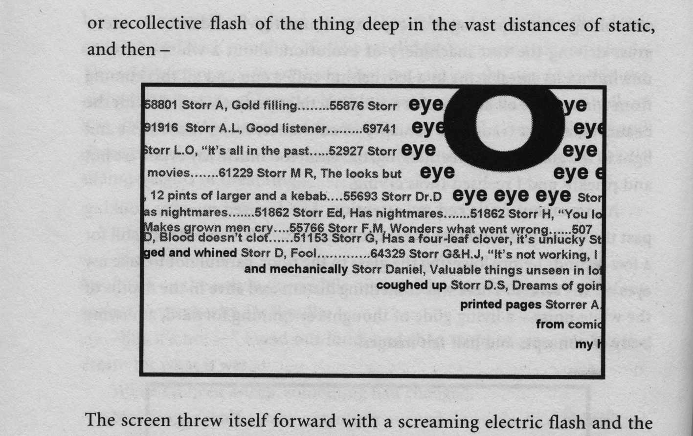
Another species of conceptual fish appears later in the novel. Eric II is surreptitiously fed a Luxophage, a revolting tapeworm-like creature that he vomits onto the floor:
The bold @ makes a dark, sphincter-looking mouth – combined with the hollow 0 eyes and snaky form, this is a horrible thing to have been inside someone. By developing these ‘lesser’ species, Hall strengthens the verisimilitude of his conceptual realm, fleshing it out with a whole universe of creatures.
Series of ‘scientific’ illustrations/ephemera
Eric II must reach scientist Dr Trey Fidorous, the only man who can help him kill the Ludovician, by following a trail of notes left in various public places: on fly-posters in train stations, stencilled on tiles in a stairway, stuck on a floppy-disc found in a bus station. Five reproductions of these pieces of ephemera are included sequentially, with captions written by Eric II:
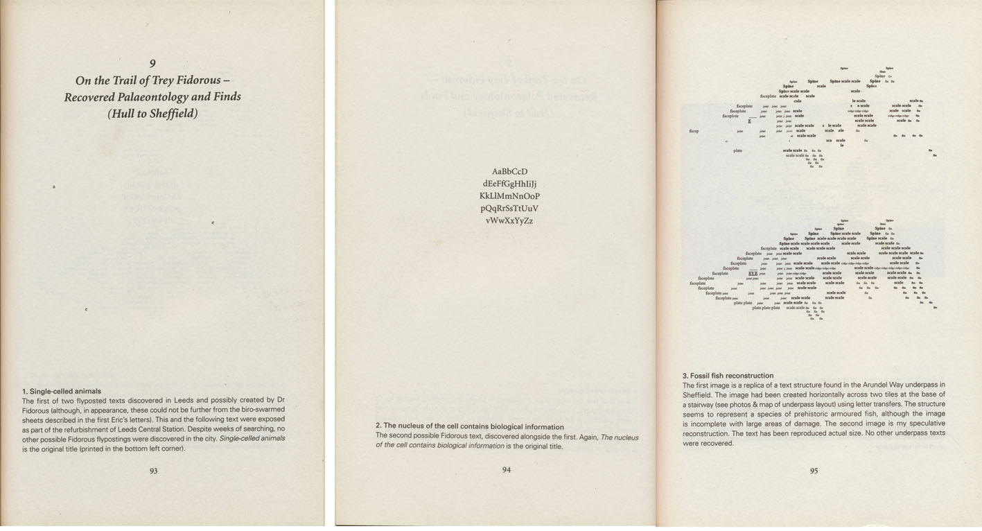
Eric II is piecing information together as he goes. He includes these pieces of found ephemera as evidence. He is as sceptical as we are about the conceptual world at this stage, so these documents are presented less as proof that the conceptual world exists, and more as proof that he is actually finding these clues – whatever they are. We understand what Eric II does, as he does.
The relationship between the written captions and images is important here. The ephemera is presented in a scientific way: centred on the page, with a ‘factual’ caption. The tone of the writing directs our interpretation of these pieces of ephemera as ‘evidence’, amplified by the sans serif typeface, bold numbers and label headings. The tone and graphic presentation imply objectivity in the way Eric II presents these pieces of ephemera.
The captions below the images on these pages also refer to other ephemeral items that are not included in the novel. Presumably, Eric lost this ephemera along the way. Or perhaps these are documents Hall has made available in the ‘conceptual world’ outside the novel – on various blogs and Internet sites related to the book. That these lost pieces of ephemera are mentioned but not shown is intriguing, and adds to the sense that the conceptual world is unpredictable.
Many reviewers enjoyed Hall’s devices, calling them ‘quirky elements [that] infuse the novel with a piquant avante-garde flavour’ (Gioia 2007); ‘the 50-page flipbook of an approaching shark late in the novel is surprisingly effective and chilling in context’ (Ness 2007); and ‘strangely beautiful’ (McCarthy 2007). Despite the wave of praise for this novel, Hall too has been criticized for resorting to visual ‘gimmickry’. Like Safran Foer, Hall addresses these criticisms as a kind of literary snobbishness:
These storytelling techniques are still considered ‘experimental’ or even worse, ‘gimmicky’ in some book circles; whereas in art you can sit in a gallery with a dead lobster on your head for a week without fear of being accused of either. (Gallacher 2007)
Similarly again, Hall explains his use of typographic devices and images as tools to tell a particular kind of contemporary story: ‘It’s never been about selling lots of books for me – it was always about finding new ways to tell a story and look at the how a story can exist and evolve in the world we live in today’ (Baby Got Books 2001).
Conclusion
This article discusses a range of novels that incorporate typographic devices for literary effect. Reading these novels, typographic devices are first noticed as interruptions of the ‘grey rectangle’ of type on the page. To help recognize how we understand similar typographic cues in other genres, it is worth considering how visual poets – and the literary critics and scholars who analyse their work – discuss readers’ engagement with the material form of language. John Hall, a visual poet, explains:
Handwritten and printed poetry draws patterns on pages which a reader encounters before any sounding – actual or imagined – of words begin. Experienced poetry readers take in at a glance a number of spatial features that will translate later into temporal ones: on any occasion of reading off the page the first reading is, in other words, a visual one of a different order from the systematic decoding of the visual signs of alphabetic script. (Hall 2003)
The first reading of text on a page, then, is a visual one. A critical reader approaches the ‘pre-reading’ of a poem by looking for visual signposts or prompts. John Hall explains that readers:
…pick out the visual patterning of punctuation marks: will see something about syntax, especially perhaps sentence length and clausal complexity, and will anticipate how this plays off against line and stanza breaks. Any such anticipation sets the conditions for reading. (Hall 2003, italics in original)
Novels that integrate typographic devices into the primary text should be approached in the same way. Readers are drawn up to the surface of the page, and asked to consider how the breach of the conventional typographic structure effects their engagement with the novel. Here, I have presented a range of typographic devices in different novels and offered a description of how these devices effect the reading of those novels.
The article aims to draw attention to the integration of typographic devices in novels as a literary phenomenon. Although this cannot be claimed as a new phenomenon – Laurence Sterne was experimenting with typographic devices two centuries ago – the influx of such novels appearing in the past decade is significant enough to make this a timely discussion. Perhaps this influx reflects a growing visual literacy that comes with access to digital media that offers opportunities for users to chose which typeface we use to read our e-mails, online publications and even set the ‘notes’ on our smart phones; or increasingly user-friendly desktop publishing software that allows authors to experiment with the design of the text during the writing process. These are speculations better made by social scientists than designers. As more novels integrate typographic and other graphic devices into the primary text, these devices will perhaps be considered contemporary conventions of the genre, and as such, new ways to describe and critique these new conventions are needed. As a designer, I have observed writers borrowing typographic devices from my creative toolbox; here, I also offer the literary world a designer’s critique of how these devices work.
End notes
- Cultural theorist Robert Stam explains the issues around defining ‘genre’: ‘A number of perennial doubts plague genre theory. Are genres really “out there” in the world, or are they merely the constructions of analysts? Is there a finite taxonomy of genres or are they in principle infinite? Are genres timeless Platonic essences or ephemeral, time-bound entities? Are genres culture-bound or transcultural?’ (Stam 2000).
- In the novel, both Oskar’s father and grandfather are simply called Thomas – I refer to the grandfather as Thomas Senior here to avoid confusion.
- One review is titled ‘Gimmicks drown out power, poignancy’ (Upchurch 2005) and another, ‘A bag of tired tricks’ (Meyers 2005).
References
Abrams, M.H. (1985), A Glossary of Literary Terms, Fort Worth, TX: Harcourt Brace.
Baby Got Books (2001), ‘Interview with Steven Hall: Part 1’, Baby Got Books, 15 August, http://www.babygotbooks.com/2007/08/15/interview-with-steven-hall-part-1. Accessed 3 December 2007.
Barton, E. (2006), ‘Interactive storytelling’, Print, 60: 2, pp. 160–62.
Brown, H. (2007), ‘What’s behind the cover (and we don’t mean the book)’, The Telegraph, 18 August, http://www.telegraph.co.uk/arts/main.jhtml?xml=/arts/2007/08/18/nosplit/ bodesign118.xml. Accessed 4 September 2007.
Danielewski, M.Z. (2000), House of Leaves, New York: Pantheon Books.
Egger, D. (2009), You Shall Know Our Velocity, London: Vintage.
Gallacher, L. (2007), ‘The Future of English’, radio broadcast, Lingua Franca, ABC radio national, 23 June, http://www.abc.net.au/rn/linguafranca/stories/2007/1956628.htm#transcript. Accessed 10 October 2012.
Genette, G. (1997), Paratexts: Thresholds of Interpretation (trans. J.E. Lewin), Cambridge: Cambridge University Press.
Gerber, A. and Triggs, T. (2006), ‘Acrobat Reader’, Print, 60: 4, pp. 62–67.
Gioia, T. (2007), ‘The Raw Shark Texts’, Blog Critics, http://blogcritics.org/archives/2007/04/15/222015.php. Accessed 14 October 2008.
Harper Collins Canada (2007), Steven Hall Talks the Raw Shark Texts, Book Television, http://www.youtube.com/watch?v=orUbJ9n5Chg. Accessed 17 September 2007.
Hall, J. (2003), ‘Time-play-space: Playing up the visual in writing’, Pores: An Avant-Gardist Journal of Poetics Research, 3, http://www.pores.bbk.ac.uk/3/John%20Hall%20Time%20v2.pdf. Accessed 10 October 2012.
Hall, S. (2007), The Raw Shark Texts, Edinburgh: Canongate Books.
Hudson, G. (2006), ‘Everything is interrogated’, The Village Voice, 30 March–5 April, pp. 32–35.
Jain, P. (2005), ‘Extremely Loud and Incredibly Close’, Salon.com, 20 March, http://dir.salon.com/story/books/review/2005/03/20/foer/index.html. Accessed 15 March 2006.
Lessing, D. (1962), The Golden Notebook, London: Michael Joseph.
McCarthy, T. (2007), ‘Straight to the multiplex’, London Review of Books, 1 November, http://surplusmatter.com/reviews/straight-to-the-multiplex. Accessed 7 November 2008.
Meyers, B.R. (2005), ‘A bag of tired tricks’, The Atlantic, May, http://www.theatlantic.com/doc/200505/myers. Accessed 27 February 2007.
Ness, P. (2007), ‘Fishy tales’, The Guardian (Features and reviews), 10 March, p. 17.
O’Connor, J. (2007), Redemption Falls, London: Harvill Secker.
Ohlsen, B. (2007), ‘In search of the surreal’, BookPage: America’s Book Review, April, http://www.bookpage.com/0704bp/fiction/raw_shark_texts.html. Accessed 6 May 2007.
Plascencia, S. (2005), The People of Paper, San Francisco: McSweeney’s Books.
Poynor, R. (2003), ‘Evolutionary tales’, Eye, 49: 13, http://www.eyemagazine.com/critique.php?cid=242. Accessed 27 February 2007.
Riffaterre, M. (1980), Semiotics of Poetry, London: Methuen.
Safran Foer, J. (2002), ‘A Primer for the Punctuation of Heart Disease’, The New Yorker, 10 June, pp. 281–92.
——— (2005), Extremely Loud and Incredibly Close, Boston: Houghton Mifflin.
Safran Foer, J., Sugimoto, H. and Matsumoto, T. (2006), Joe, New York: Prestel Publishing.
Schiff, K.L. (1998), ‘The look of the book: Visual elements in the experience of reading from “Tristram Shandy” to contemporary artists’ books’, dissertation thesis, University of Pennsylvania, Pennsylvania.
Sadokierski, Z. (2010), ‘Visual Writing: A critique of graphic devices in hybrid novels’, Ph.D. thesis, University of Technology, Sydney.
Stam, R. (2000), Film Theory, Oxford: Blackwell.
Sterne, L. (1759–67), The Life and Opinions of Tristram Shandy, Gentleman, London: Ann Ward (vol. 1–2)/Dodsley (vol. 3–4)/Becket & Dehondt (vol. 5–9).
Upchurch, M. (2005), ‘Extremely Loud and Incredibly Close: gimmicks drown out power, poignancy’, The Seattle Times, 14 April, p. K.10.