Where the book went next
Digital Culture Talk, National Library of Australia
9 December, 2014
Event blurb:
How we read has been evolving since the advent of the internet and mobile devices now mean a good read is never more than a tap away. Rich media, e-books, new channels and other technological innovations have re-invented the book for the digital age. Join our panel of practitioners, including Simon Groth, Manager of if:book Australia, Zoë Sadokierski, President of the Australian Book Designers Association, and Charlotte Harper, founder and publisher of Editia, as they discuss the future of books.
Today, I’m going to talk about how digital technologies allow us to create and share stories in new ways:
— digital technologies allow us to create publications in which words and images are grafted together – creating rich, complex reading experiences.
— digital technologies challenge us to make decisions about which kinds of content stay static on a page, and which become dynamic on screen.
There are some very exciting bookish experiments going at the moment, and I thought I’d begin by sharing my two favourite sites to find experimental publications – the Literary Platform and the Publishing Lab – before talking through a recent book project of my own.
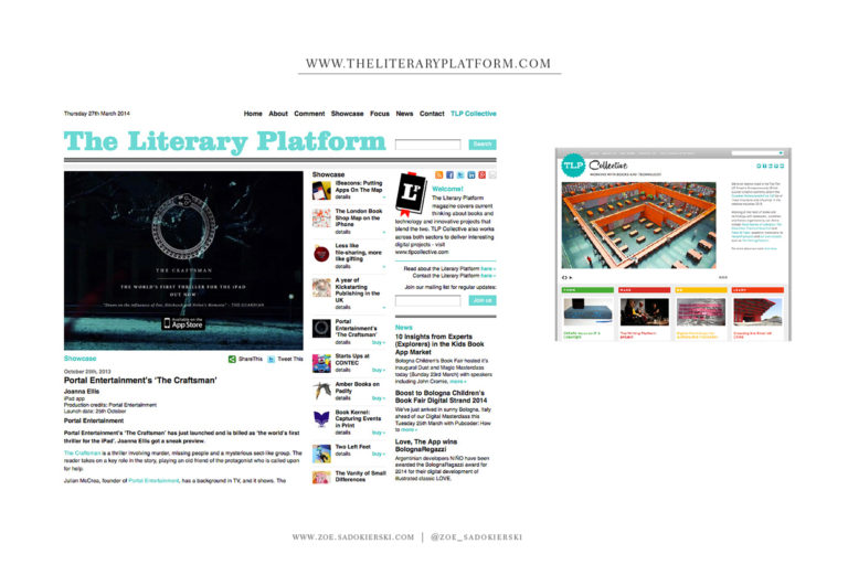
First, The Literary Platform is a London-based online magazine that deals with the intersection between books and technology. Set up in 2009 by Sophie Rochester, the site is a treasure chest of projects – apps, enhanced ebooks, games and websites with a literary slant. Alongside the magazine, Sophie – who has a background in commercial book publishing – formed a consultancy business, attracting a collection of like-minded folk. TLP Collective work with publishers, academic institutions and other organisations to research and run workshops around the impact of technology on writing and publishing.
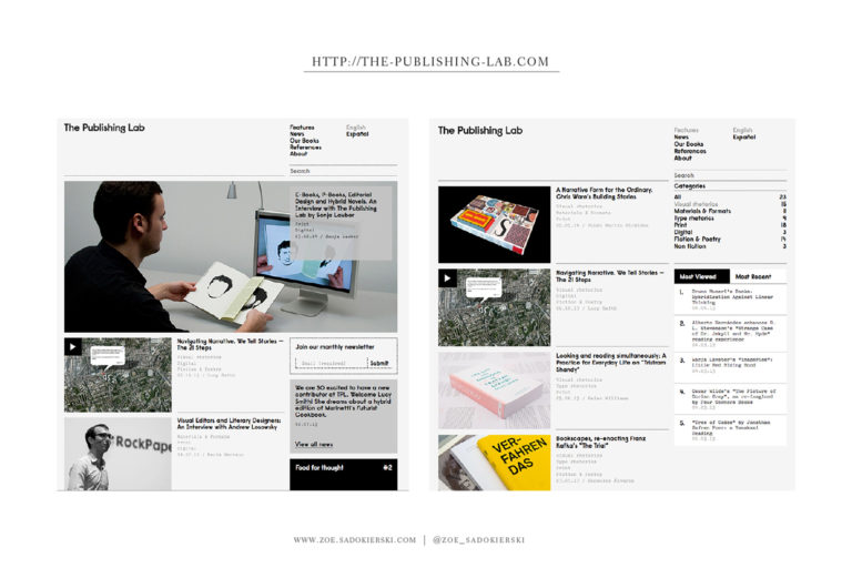
Second, The Publishing Lab has a more academic slant, with essays and longer critique of experimental book projects. Co-founded by Alberto Hernandez and Maria Serrano, originally as a FB page, The Pub Lab has a more direct manifesto:
We believe that 21st century narratives must both demand and create savage readers, not tame readers. We think this makes good training for being able to read all social narratives, and the real world, with a critical stance. We don’t think textual hybridization is the only way to do this, but we think it is a good way to do it. In the hands of a designer, writer or editor who is humble, sharp and generous, multimodal narratives will become useful training tools for the savage readers our society is so much in need of.
What’s most interesting, to me, about this manifesto is that they bring the designer into the fold: “in the hands of a designer, writer or editor who is humble, sharp and generous.” As a book designer, this is a great call to action.
Stepping into this new publishing landscape, designers have an opportunity to shift from the end of the production process, to the very start of the content creation phase of a book project. I’m going to talk through book experiment of my own, to illustrate what I mean.
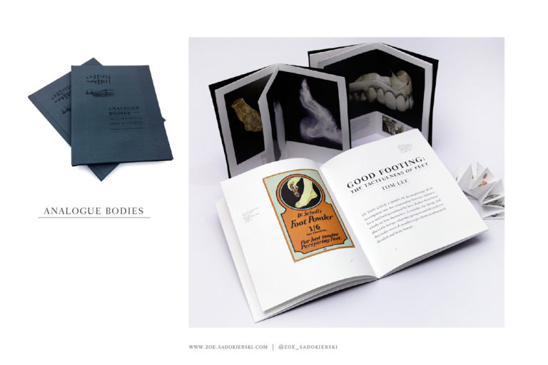
Analogue Bodies is a collaboration between myself and a writer, Tom Lee. Tom and I collaborated previously, when I turned his essay on the A Poetics of the Naughty into a zine, and we turned a trip to his family farm with another colleague, into an exhibition of works on paper.
Tom often sends me, and other friends, early drafts of his essays for feedback. In July 2013 Tom wrote me an email:
You’re probably sick to death of my writing, but I’ve attached an essay I wrote … it’s about foot feelings and features a cameo from farm things: burrs, sheep, mud, dad–as well as Bruce Willis.
I responded:
So I love it, of course, and I’m totally doing a foot book.
10 months later, at the Emerging Writers Festival in Melbourne, we presented a fully illustrated 90-page book that includes Tom’s foot essay alongside another essay he wrote about teeth, and five smaller books I made in the process. This is how it unfolded.
Because Tom’s essays were on feet and teeth and I’m not an anatomical illustrator, I thought I’d see what I could do with Creative Commons images. Creative Commons are licenses that copyright holders put on images, written texts, music – all sorts of digital files – that allow people to reuse them for free, as long as they are credited.
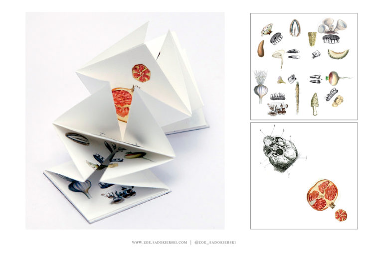
As I read and re-read Tom’s essays, I started to collect images of feet and teeth and collaging them together. It’s a kind of thinking through making that helps me understand how to create a visual dimension for a written text. This is a flower fold book I made using images of teeth, and things that look like teeth. Images taken from the site Vintage Printable.
I found the Wellcome Library, a science library in London, with an incredible collection images that have been released for use with creative commons licenses.
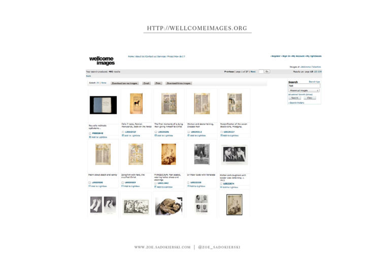
Increasingly, cultural institutions such as libraries and museums are digitising their collections: digital technologies allows them to scan and make accessible their collections for widespread use. This is gift for illustrators and designers.
I decided to illustrate Tom’s essays using ONLY images from either Vintage Printable or the Wellcome Library. On this double page spread, the tooth is from Wellcome and the lemon and crab are from Vintage Printable.

On the left, next to a passage that reads:
the structure of the tooth is for the best part composed of a dense tubular stuff known as ‘dentine’. Like oranges and lemons, teeth contain pulp. I found this idea troubling.
To the right:
Indeed, it is more reassuring to think of a tooth as a densely resistant pebble than as a potentially homely shell. This idea now calls to mind the experience of abject horror that I felt when discovering a small, translucent crab nested in a muscle shell that I expected to house only muscle.
I placed these illustrations here to enhance Tom’s written text. The illustrations illuminate the writing.
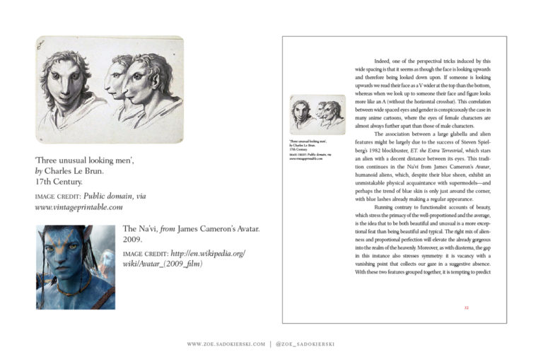
Here, I stumbled across the image of ‘Three Unusual Looking Men’ and recalled reading Tom’s passage about the way aliens are represented in popular culture, with mention of James Cameron’s Na’vi, from the film Avatar. 17th Century, versus 2009. Placing this image here, I’m extending Tom’s text. I’m adding information, through the image and caption, that is not mentioned by Tom. Not every reader will pick this up, but a close reader will be rewarded.
And this is what a HYBRID book can do – an unexpected image can extend the text, opening up a richer reading experience.
I would never have found this image without the digital technology that allows me to search in a loose, and unfocused way. The digital archives revealed masses of fascinating images. I didn’t want to laden Tom’s essays with these images – an occasional visual aside brings richness to the reading experience, but too many brings a busy-ness that turns people off reading. And the whole purpose of the project was to get people to read Tom’s essays.
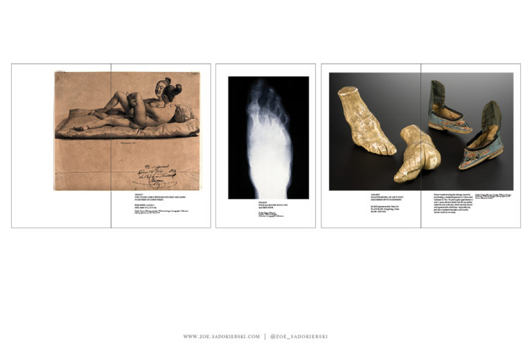
So I made some extra books – visual essays that accompanied Tom’s writing, but sat beside it rather than amongst it.
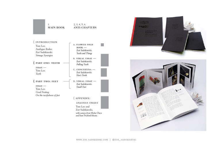
TEETH – talismans and strange rituals:

FEET – foot binding.
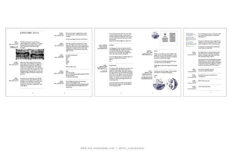
I call these extra books ‘anti-chapters’. My intention was that after reading the main book, you could dip into these extras, Like the extra features on a DVD. The final extra feature is a book that collates every email we sent to each other in the process. This is an archive of our digital collaboration. Tom sent me images, I sent him texts. He influenced my visualisation, I influenced his writing.
–
When we talk about the future of the book, the focus is often on the book object:
What will become of the printed book in a digital age?
Are ‘enhanced ebooks’ already dead?
When will a single device appear that is capable of displaying all the different types of digital books?
There’s also a lot of talk about how new technologies disrupt old systems of book production and distribution:
Will Amazon and online retail eradicate bricks and mortar bookstores?
Will print on demand allow smaller, independent presses to play a bigger role in the market, as indie music labels have?
What I discussed today is less about the book object and ways we move it around, and more about the guts of the thing. Because as a designer, the content is always where I begin my process – everything else follows. I hope for the non-designers in the room, this discussion of my design process acts as a reminder that in the messy network of people, machines and process that make up the book publishing industry, designers have an important role to play. In other words, please don’t replace us with algorithms.
Here is a recording of the talk. Posted above are my notes to speak from, not the transcript – I never stick to the script so the talk is different – I can’t listen to recordings of myself, so I’m not sure how different:
